


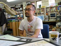
His/Her MOTHER Feeling: Kouichi Oyama’s Opinion
by: Echoes on 4/28/2020
In truth, I still do not understand very well this popularity surrounding MOTHER 2‘s artworks. I feel it is no different from any other game. I also believe that it does not reach a professional level, strictly speaking. In a certain way, could I say we may even consider them as amateurish or just foolish? In the end, unable to rival the pros, I had no other choice but to fight with my own colors and that maybe is what gives to MOTHER 2 this different and original aspect.
Creating the first MOTHER game was a huge load of work for the people involved. It was the cornerstone for everything. However, to be honest, I think that the graphics in MOTHER 2 differ from the first one. To put it simply, I would say that—if we had to compare the style of these two games—I think the first one is better. Sure, me and my staff’s feelings completely differ but you could say that I have always found the first MOTHER‘s design really cool.
The visuals in MOTHER 2 are pretty far from the reality of daily life. For example, you could say that this or that plant could never grow in this or that environment. Some zealous illustrators do extensive researches for their drawings but I do not really pay much attention to that [laughs]. Thus, by playing it again recently, I had the feeling that the roads could have been somewhat rectified. In fact, I have only just obtained my driver’s license recently, that is why the way I designed cars and streets back then lacked realism.
That is why, while I was playing MOTHER 2, I said to myself: “Uh?? Are these traffic lights at the right place?” [laughs]. I hadn’t even thought about whether the traffic should be on the right or on the left. You can feel that it lacks realism. Equally, when I am drawing a plant without doing any research on the specificities of their environment, I draw vegetables on top of my head and ask myself if that is the right direction. Well, when I use my common sense, I refrain myself from drawing what obviously cannot be believable but beyond that, it can be something vague or unexpected.
I drew characters that I felt like drawing. I used the first episode as a reference while drawing the characters for its sequel in my own way. When looking at my previous illustrations, the game designers would often tell me to, “Put it here”. For important scenes, Mr. Itoi had some requirements for given characters but apart from that, I was free to draw whatever I wanted. Mr. Itoi’s requirements were repeated several times in advance. By listening to them, I could imagine what I would draw. Depending on the situation, there were times when Mr. Itoi would draw sketches. It was therefore easier to draw the characters.
As far as the cities were concerned, it was much more difficult. Since cities demand a certain volume, I had to vary using different materials. It is a little technical, but the way I proceed is by combining different drawings with an image of an 8×8 point unit. It is really quite difficult to combine them well in order to obtain different buildings by using the same material in several places. The common denominator between two materials must be taken into account in order to maximize the efficiency of the combination. Through this process you obtain a brand. I was therefore able to mark the world of the first MOTHER game, but as the image of MOTHER 2 is more specific that in the first one, some parts could not be noticed. Honestly, it felt like I was doing a never-ending puzzle.
One of the difficulties was that, in MOTHER 2, there are a lot of signs that use some letters of the Latin alphabet. Words like “HOTEL” or “HOSPITAL” required more space than they would have taken up in Japanese. And so, if you look carefully, you might think, “Isn’t it a different typography?”. But since there was not enough space, I did not have much choice [laughs]. That way, by using the same material as much as possible, I had to draw the city hall, the game center, the trees, the fences and the cliffs. In most games, the screen changes when you enter a city and through this process, there is an opportunity to change materials. But as the world of MOTHER is a vast area of places connected to one other, this is almost never possible. It was therefore the most difficult task to carry out. Yet, since this part of my work cannot be seen with a human eye, I was not really complimented on that. But I am pretty proud to have been able to reach a certain level of quality despite those complex obstacles.
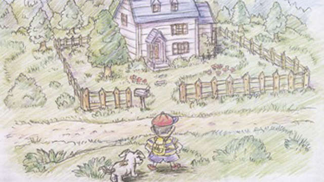
Of all the places that demanded a lot of work, I would cite Onett. Onett was the place that was the most difficult to create. Since it was the first city to be created, it had to be big. The place I like the most? Onett, of course! [laughs] Since Onett is a city where everything is concentrated, it’s the one I like best.
Personally, the world that I have created and that I like best is Magicant. I have already said it earlier but the first MOTHER game’s Magicant is a wonderful achievement. How could I put it…I think that Magicant possesses a major feeling like in a Spielberg movie, a mysterious world that gets your imagination working. In comparison, the Magicant of MOTHER 2 is, I believe, more my way. But it’s exactly how I wanted to draw it. Really, I’m not the type of man that particularly values vibrant atmospheres so it was a lot of work to breathe life into the towns when drawing them. It might be because Magicant is not a very animated place that I was able to freely put my own colors in it.
When MOTHER 1+2 came out, I think that a lot of people discovered this universe for the first time. But because Mr. Itoi wanted a universal tale, about human life or love between parents and children, I think everyone can enjoy it, no matter the era. Personally, graphically-speaking, I would like to return to MOTHER‘s era. This way, I think that Mr. Itoi’s writing would make much more of an impression. The more a picture becomes concrete, the more the writing will be limited.
Nine years later, if you ask the staff who worked on it, starting by Mr. Itoi, all will agree that the objectives have been reached. But you know, as far as I’m concerned, I do not consider MOTHER 2 that way [laughs]. Inside me, it is not over yet. Maybe it’s a big inferiority complex. At that time, I couldn’t take a realistic route, and I felt that I couldn’t compete with Mario and Yoshi’s direction. Therefore, even if I had no choice but to do it my own way, I really had a huge lack of self confidence.
Nowadays, reading the mails from all the users, I feel very rewarded. At that time, there was no email or Internet, so I didn’t have much more than echoes. It’s probably a wonderful game if so many people remember it. Everybody can say that it was created with passion. Even now, I still think this is a foolish game [laughs]. I mean, it didn’t need to be so full of it, because this foolishness is everywhere. And not only in the drawings. Ten years later, I have a lot of mixed feelings about it, but it sure was a very important work for me.